I was able to attend a presentation at Havertys on the 2013 color forecast by Sherwin-Williams. I decided to create a painting for each of their four palettes.
Below are my paintings with the Sherwin-Williams description and a link to their color card.

“The Mystery of Time”
Midnight Mystery
Ssshh! We’ve got a secret. It’s our dark side, and we’re irresistibly drawn to exploring its murky depths and shadows. The colors are moody, the vibe is masculine and the aesthetic is both Victorian and futuristic. Visible mechanicals intrigue us, while theatrical effects, eerie collections and menswear-inspired fabrics like tweed and houndstooth evoke Sherlock Holmes and the Prohibition era of secret doors and speakeasies.

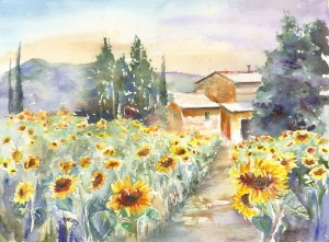
“Marseille”
Honed Vitality
Time and nature work hand in hand to create a softened beauty that is restful and comforting. We experience it in the layered hues of mineral deposits, sea-buffed stones and the weathered shutters of a rustic farmhouse. The colors are chalky and earthy, the materials raw and organic, the finishes matte.
It’s a homespun aesthetic inspired by our renewed appreciation for artisan craft, handmade quality and homemaking as a valued skill rather than a chore.
Vintage Moxie
We feel pretty, oh, so pretty, in a demure mid-century way — but with a new, modern edge. The retro glamour of pearls, florals and classic feminine silhouettes are tempered by fun and funky accents and attitude. The pastels are a bit bolder, including semi-precious gem tones like citrine, peridot and amethyst, set off by crisp neutrals. The look is still ladylike — but much more free-spirited than in your mother’s day.
It’s a homespun aesthetic inspired by our renewed appreciation for artisan craft, handmade quality and homemaking as a valued skill rather than a chore.

High Voltage
Electronics, alternative rock and digital technology — plug those influences into one socket and you get a blast of high-voltage look-at-me colors. We’re not shying away from them; we’re splashing them across everything from cars to appliances to upholstery. It’s consumerism as self-expression, giving the bold and the not-so-bold equal permission to be non conformists. All those bold hues need a palette purifier, bringing black, white, gray and clear acrylics into the picture.